
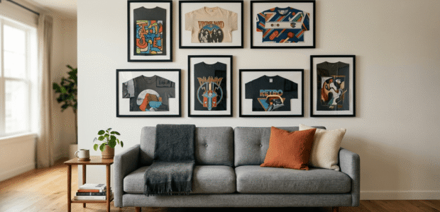
A single framed t shirt on a wall is a nice detail. A whole wall of them, arranged well, turns into a real statement, the kind of display that makes people stop and look. The difference between a gallery wall that feels curated and one that feels cluttered almost always comes down to planning, not the shirts themselves.
If you’ve got a growing pile of concert tees, old jerseys, race shirts, or band merch that deserves better than a dresser drawer, here’s how to actually plan a t shirt gallery wall that looks like it belongs in a magazine, not like it happened by accident.
Start on the Floor, Not the Wall
The single most useful habit in gallery wall planning is resisting the urge to grab a hammer first. Lay your frames out on the floor in the arrangement you’re considering, then live with it for a bit before committing to a single nail hole. This gives you the freedom to move things around, swap positions, and catch problems (a corner that feels heavy, a color clash, an awkward gap) before they’re permanent.
Since Shart frames all share the same shape and size, this step is even easier than a typical gallery wall with mismatched frame sizes. You’re really just solving for arrangement and orientation, not juggling a dozen different frame dimensions at once.
Decide on Horizontal, Vertical, or a Mix
One advantage of t shirt frames is that each one can be hung horizontally or vertically depending on how the shirt itself is displayed. This gives you a genuinely flexible design tool that a standard photo gallery wall doesn’t have.
- All horizontal creates a clean, structured, almost architectural feel. This works especially well in a long, narrow space like above a couch or along a hallway.
- All vertical feels a bit more like a traditional gallery wall of framed art, with each piece reading as its own tall column.
- A mix of both adds visual rhythm and energy, and tends to feel more collected and personal, like the wall grew organically over time rather than being planned in a single afternoon.
If you’re just getting started with two or three frames, sticking to one orientation keeps things simple. Once you’re working with five or more, mixing orientations gives the wall more movement and makes it feel intentional rather than repetitive.
Pick a Layout Style That Matches the Mood You Want
Grid layout. Frames aligned in even rows and columns with consistent spacing throughout. This is the cleanest, most formal option, and it’s a great fit for a matched set of jerseys, team shirts, or a themed collection where uniformity is part of the appeal.
Linear layout. Frames aligned along one shared edge, either all their tops, bottoms, or centers lined up in a row. This works beautifully above a couch, a console table, or a headboard, since it reads as one cohesive unit rather than a scattered collection.
Salon style. A looser, more asymmetrical arrangement where frames of varying orientation are grouped together without strict alignment. This style feels collected and eclectic, like the wall has grown over years rather than being installed all at once, and it’s especially well suited to a wall full of shirts with real personal history behind them, concert tees, race shirts, shirts from trips or milestones.
Nail the Spacing
Spacing is what separates a wall that looks planned from one that looks scattered, and it’s one of the easiest things to get right once you know the target range. Aim for roughly two to three inches between frames. Tighter than that starts to feel cramped, and looser than four inches starts to feel disconnected, like the pieces don’t belong to the same grouping.
Whatever spacing you choose, keep it consistent throughout the whole arrangement. A wall with three inches between some frames and six inches between others will always look slightly off, even if you can’t immediately put your finger on why.
Center the Whole Arrangement at Eye Level
Treat your entire gallery wall as one large piece rather than a collection of small ones. The center of the full grouping, not each individual frame, should land around 57 to 60 inches from the floor, which lines up with average eye level. This is the single most common mistake in gallery wall planning: hanging too high because each frame is being centered on its own rather than as part of the whole.
If you’re hanging above furniture, like a couch or a bed, leave at least a few inches of breathing room between the top of the furniture and the bottom of the frames, and aim for the overall width of your arrangement to span at least half to two thirds of the furniture’s width so it doesn’t look like an afterthought floating above it.
Use an Odd Number of Pieces When You Can
This is a small detail, but it makes a real visual difference. Groupings of five, seven, or nine frames tend to read as more balanced and intentional than even numbered groupings, which can start to feel a bit too symmetrical or predictable. If you’ve got an even number of shirts you want displayed, consider adding one more small accent piece, a smaller frame, a shelf item, or simply leaving room to grow into an odd number over time.
Trace, Tape, and Test Before You Drill
Before any nails go into the wall, trace each frame onto kraft paper or newspaper and cut out the shapes. Tape these paper templates to the wall in your planned arrangement and step back to see how it actually reads at full scale. This step catches spacing issues, awkward height placement, and overall balance problems while they’re still easy (and hole free) to fix.
Mark where each hanger needs to go directly on the paper template before removing it, so when you’re ready to hang for real, you’re working from exact measurements instead of guessing.
A Few Final Tips
- Leave room to grow. If your t shirt collection is likely to expand, plan your initial layout with some breathing room on one side rather than filling the wall completely from day one.
- Group by theme if it helps tell a story. Sports jerseys together, band tees together, or shirts from a specific era or trip grouped as their own cluster can add narrative structure to an otherwise loose arrangement.
- Step back often while you’re planning. What looks right up close on the floor can read differently from across the room, so check your layout from a normal viewing distance before committing.
- Don’t overthink perfect symmetry. A wall that’s slightly asymmetrical but well spaced almost always looks more natural and lived in than one that’s forced into rigid perfection.
Frequently Asked Questions
How many t shirt frames do I need to start a gallery wall? There’s no strict minimum, but three to five frames is usually enough to read as an intentional grouping rather than a couple of standalone pieces. You can always expand the layout over time.
Should all my frames be the same orientation? Not necessarily. A single orientation looks cleaner and more formal, while mixing horizontal and vertical frames adds movement and feels more collected. Choose based on the mood you want for the space.
What’s the biggest mistake people make with gallery walls? Hanging too high is the most common issue, usually because each frame gets centered individually rather than treating the whole grouping as one piece centered around eye level.
Do I need to keep the spacing exactly the same between every frame? Consistency matters more than the exact measurement. Somewhere between two and three inches works well for most spaces, but whatever you choose, keep it the same throughout the arrangement so it reads as unified rather than random.