
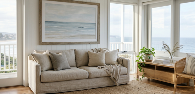
There’s a particular kind of coastal room that stops you at the doorway. It’s not covered in anchors or lifesaver rings. There’s no “Life’s Better at the Beach” sign propped on a shelf. Instead, the walls do something quieter, a stretch of shoreline, a faded blue horizon, a piece of driftwood-toned art that makes the whole space feel like it’s breathing salt air, even if the nearest ocean is three states away.
That’s the version of coastal decor most people are actually chasing in 2026. The theme-park beach house look has mostly aged out. What’s replaced it is calmer, more editorial, and honestly a lot easier to get right, once you know what to look for.
Coastal Doesn’t Mean Literal Anymore
For a long time, “coastal wall art” was shorthand for shells, sailboats, and starfish arranged in a grid. That style still exists, but it’s fallen out of favor in homes that want to feel elevated rather than themed. Designers now lean toward quiet landscape photography, soft abstract seascapes, and muted, sun-bleached palettes, sand, driftwood, stone, faded denim blue, instead of anything that screams “beach gift shop.”
The shift is really about restraint. A single striking photograph of open water or a hazy coastline does more for a room than five small nautical prints ever could. If you’re shopping for a piece right now, ask yourself whether it evokes the feeling of being near water, rather than illustrating it literally with an anchor or a rope knot. Feeling beats iconography almost every time.
Start With the Room, Not the Art
It’s tempting to fall in love with a print first and figure out the wall later. Flip that order. Walk into the room you’re decorating and pay attention to three things before you shop:
- The light. North-facing rooms and dim hallways read better with warmer, sandier tones. Bright, sun-filled rooms can handle cooler blues and grays without feeling cold.
- What’s already there. Linen upholstery, natural wood, woven textures, and stone accents all pair naturally with coastal art. If your room already leans warm and textural, look for art with some grain or brushwork rather than something flat and glossy.
- The scale of the wall. A small print on a large, empty wall almost always looks like an afterthought. Measure before you fall for anything.
Size Is the Decision Most People Get Wrong
This is worth its own section because it’s the single most common mistake in wall art shopping. A general rule of thumb: your art (or a grouped arrangement) should cover roughly 60–75% of the width of the furniture it hangs above, a sofa, a console, a headboard.
Oversized art has stayed popular for a reason that has nothing to do with trends: one large, well-chosen piece gives a room instant focal point without the fuss of arranging a gallery wall. For a living room or a primary bedroom, don’t be afraid to go big, a 40- to 60-inch piece can anchor a space in a way three smaller frames never quite manage. For narrower spots, like the wall above a bed or a stairwell, look specifically for long, horizontal formats rather than resizing a square piece to fit.
Choosing a Palette That Actually Works With Your Room
Coastal palettes have gotten more sophisticated. Rather than the classic navy-and-white beach-house combo, the current direction favors warm neutrals, sand, oat, ivory, weathered stone, layered with soft, muted blues rather than saturated ones. It’s a palette that reads as “calm” more than “nautical,” which is exactly why it works in homes that aren’t otherwise decorated with a beach theme.
A few practical guidelines:
- If your walls are already white or off-white, a warm, sandy piece will feel cohesive rather than stark.
- If your room has a lot of cool tones already (gray sofa, chrome fixtures), a muted blue-gray seascape will blend rather than compete.
- Avoid art with more than two or three dominant colors if the room already has a strong palette, coastal art is meant to feel like a pause, not another pattern to coordinate.
Photography vs. Painterly Styles
Coastal wall art generally splits into two camps: photography and painted or textured work.
Photography, a quiet cove, a hazy horizon, a weathered dock, tends to feel grounded and specific. It works well in living rooms, entryways, and offices where you want something that reads as real and calming rather than decorative.
Painterly and textured pieces, by contrast, bring more depth and movement. Visible brushstrokes, layered pigment, or a hand-finished look can make a room feel warmer and more collected, especially paired with natural materials like linen, rattan, or reclaimed wood framing. If your space already leans toward a lived-in, layered aesthetic, textured art will usually feel more at home than a crisp photograph.
Neither is objectively better, it comes down to whether you want the room to feel documentary or expressive.
Framing Matters More Than People Expect
An otherwise perfect piece of art can look cheap in the wrong frame, and expensive in the right one. Real wood frames, rather than plastic or thin metal, tend to read as more considered and durable, and they hold up better over years of light exposure. Natural or driftwood-toned wood frames reinforce the coastal feel without adding another color to manage. If your home leans more modern than rustic, a black or white frame can still work with coastal art, as long as the art itself carries the warmth.
It’s also worth checking how a piece will actually arrive. Ready-to-hang framed prints with hardware included save you a second trip to a frame shop, which matters more than it sounds like it should when you’re trying to finish a room.
Where Coastal Art Works Best (and Where It Doesn’t)
Coastal art tends to shine in spaces meant for slowing down: living rooms, primary bedrooms, reading nooks, bathrooms, and entryways. It’s a natural fit above a headboard, along a staircase, or as the single anchor piece on a large living room wall.
It’s a tougher fit in rooms that already have a strong, unrelated design language, a maximalist dining room with bold wallpaper, for instance, or a home office built around a very specific color scheme. In those spaces, a single small, muted piece can work better than a large statement print that starts competing with everything else in the room.
A Quick Gut Check Before You Buy
Before adding a piece to your cart, it helps to ask a few honest questions:
- Would I still like this piece in five years, or is it tied to a trend I might tire of?
- Does the size actually match the wall, or am I hoping it’ll look bigger once it’s hung?
- Does the palette pull from colors already in the room, or am I introducing a brand-new color story?
- Am I choosing this because it’s genuinely calming to look at, or because it has an obvious beach motif?
If you can answer those without hesitation, you’ve probably found the right piece.
Frequently Asked Questions
Does coastal wall art only work in beach houses? No. The current style of coastal art — muted palettes, quiet landscapes, natural framing, works in homes far from the coast. It reads as calm and neutral rather than themed, which is part of why it’s become popular well beyond beach towns.
What size should I choose for above a sofa or bed? As a starting point, aim for the art (or grouped arrangement) to span roughly 60–75% of the furniture’s width. A long, horizontal piece is usually the better fit above a headboard than a square one.
Is it okay to mix coastal art with other styles in my home? Yes. Because the current coastal palette leans on warm neutrals and soft blues rather than heavy nautical themes, it tends to blend well with modern, Japandi, or transitional interiors rather than clashing with them.
Should I choose a photograph or a painted piece? It depends on the mood you want. Photography feels grounded and specific; painterly or textured pieces feel warmer and more expressive. Let the rest of your room’s materials ,glossy versus textural, guide the choice.
Looking for a starting point? Cove Prints’ Landscapes collection leans into quiet, photographic coastal scenes, while the Oversized collection is built for exactly the statement-piece approach described above. For something with more warmth and texture, the Vintage Art collection is worth a look.